

Caitlin NEEDS To Externally Process Her Feelings About Chartreuse (Is It A New Neutral?)
Posted by admin on

There’s this quote from The Office that’s been rattling around a bit in the back of my brain for a few weeks now. Michael’s mocking Jim (sorry for the 13-year-old spoiler, folks) and offers up this little nugget: “I can see it in your crusty little eyes that you are going to make everything perfect. If I can just think this through, if I could just think it exactly right, I can make this perfect.”
Because honestly, that’s kinda sorta what I’ve been on the hunt for recently – a perfect design process. A checklist so I can avoid mistakes. I’ve joked about it a bit on Zooms with the team – “please write down every thought you had while you were designing and installing” is my go-to line, but I’m not really joking. 11 days ago, I presented you with a dilemma: I’d procured my dream dresser but was struggling with finding a real jumping-off point. I presented three beds to the crowd, offered three possible corresponding color schemes, and we were off to the races. Then, TWO OF YOU BLEW MY MIND.


“I have a brass canopy bed. Chartreuse walls look beautiful with it,” said Patricia. “You could add lilac/mauve/violet/chartreuse/cerulean/cognac/yellow curtains, accessories or wall color, bedding or rugs,” said Mouseface (and while I wish I had created this highly-descriptive portmanteau, the credit belongs to the commenter in question). Chartreuse, huh? I started poking around the internet and landed on one image in particular that really made my heart skip a beat…

Here’s the thing: this isn’t my first chartreuse rodeo. (Click through at your own risk to see a photo of my childhood bedroom. You’ve been warned.) And while my style has changed a bit since that original introduction post – more deco, less postmodern – my love of color hasn’t really shifted.
So when I stumbled upon this shot from Luke Edward Hall’s home, I knew I wanted to make a cognac bed work with chartreuse walls and other pops of bright, saturated color. Is it going to be a lot for a bedroom? Sure. Is it possible to create a space that’s more jarring than the neon nightmare cave I created in 2004? NO. It’s all up from here, baby!!!
To that end, I started looking for more and more inspiration – you know, how to do chartreuse the right way, so you don’t feel like you’re living inside a container of sherbet – and realized that it’s a lot more flexible than I ever imagined (when chosen by adults with actual brains and thought processes beyond “NEON,” at least). Can I show you a few of my favorites? I pulled inspiration from all kinds of styles, so I can be extra sure that I’m thinking EXACTLY RIGHT. Let’s kick it off with a total stunner, yeah?

OKAY. Try this scenario on for size: I show up at your house, unannounced. “I am going to redesign your living room,” I declare. “Everything will be some variation of cherry red, navy blue, lime green, or wood.” (Wow, what a presumptuous and arrogant move from hypothetical Caitlin! So audacious! Did I even say “hello” first? Where are my manners???)
You know what you – a normal and/or rational person who has probably seen a color wheel once or twice – would say in response? It’d probably be a little something like this: “Are you insane? What are you talking about?” Or maybe even a, “NOT TODAY, HILDI. Hard pass. Please leave.” (The latter option is for those who consumed a lot of Trading Spaces in the early aughts. I would fall into this bucket, I think.)
BUT WAIT. Against all odds, the aforementioned hypothetical, manner-less, weirdly-imposing Caitlin is actually on to something here (palette-wise, at least). Peek at the above space – this bold chartreuse is elevating the room way more than a soft, cool gray or clean, bright white EVER could.
Chartreuse: 1. Other Neutrals: 0.

It’s not just paint, though. Chartreuse can add something a little fresh, unexpected, and modern to a space. Are these four chairs super loud or out-there? Not really. But does this bright, happy velvet add WAY more personality and joy than a similar piece upholstered in camel leather or jade green velvet? HECK YEAH.
Bringing this not-quite-neon, not-quite-pea-soup shade into your decor is such an easy way to add a little edge without feeling like you’re living inside an avocado, you know? (If you are interested in feeling like you’re living inside an avocado, stay tuned. I have inspiration for you, too.)


BIG SWOON. I’ve always been a fan of this color palette – some aqua, some coral, some hits of chartreuse. (Now that I’m thinking about it, this is kind of the tropical version of the earlier “cherry red, navy blue, lime green.” There’s something here, guys. Stick with me!!!) A traditional pearly-toned zellige fireplace tile would have fallen SO flat on the left; the trim on the right ups the “weird” quotient just enough to make things super cohesive on the right. MASTERFUL.

I know this technically leans a little more green than the rest of my examples, but I just had to tell you three things:
- This reminds me SO much of Erik’s home, where paint makes all the difference. (Scroll to the bottom for an incredible side-by-side of Erik’s in white and in chartreuse – it’s what I’d present as my closing argument if I was a lawyer and not a woman screaming about colors on the internet.)
- OVERSIZED LIGHT FIXTURES ARE SO, SO, SO CHIC.
- I dream of mixing and matching like this. A Bergere chair, rattan table, regency demilune console, AND pop art? Inspired.


When in doubt, go tonal. I love how much the chartreuse warms up these spaces (like, check out that atrium in the back of the photo on the left – this front sitting room is so much warmer!).
I also cannot believe how AWESOME those stainless steel cabinets look in the kitchen on the right. A more traditional subway tile in white would have left this space feeling like a hospital (read: morgue), but these brightly-colored walls bring such a great balance – do you agree???
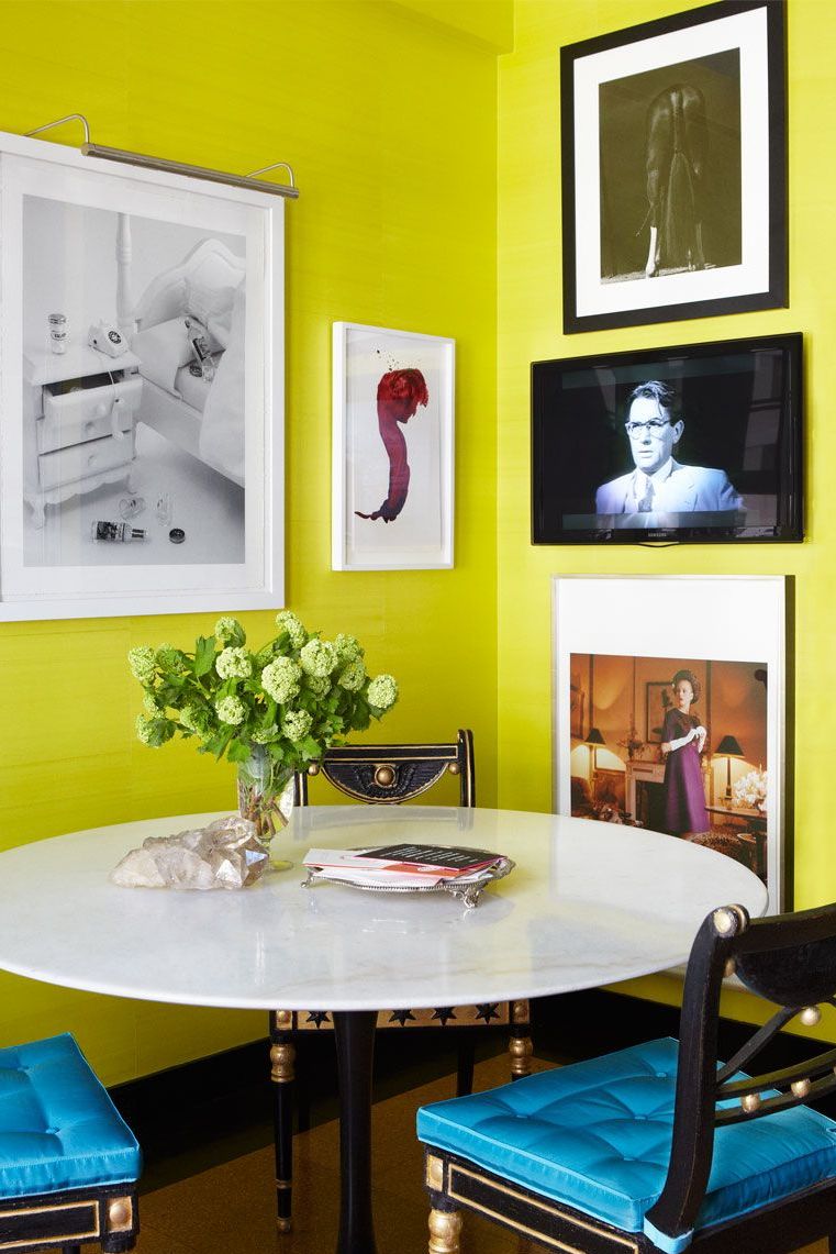
When I really distill it, I think my favorite thing about this shade is that it allows for a lot of experimentation – it’s so bold that every choice in your space will, in turn, feel a bit more thoughtful and considered and ~designed~. Would this art configuration and dining nook look fine against a beige wall? Probably! But does the whole space really sing against a neon background? YES.


Same chairs, same color palette, VERY different vibe. We’re having a dinner party in the room on the left. We’re having a very productive team brainstorm in the room on the right. Which one is your favorite?? (I think I’m leaning towards the Miles Redd-designed room on the left – I’m a huge sucker for a good chinoiserie credenza – but man, that fireplace surround on the right is DREAMY.)

Confession: This is another shot where we’re leaning a little more green than chartreuse, but check out how much depth this lone wall brings to the space. I don’t think most people stumble upon luxe, warm portraits of mastiffs and think, “oh my gosh, GOTTA HANG THIS THIS SMACK DAB IN THE MIDDLE OF MY LIME GREEN WALL,” but like…maybe they should start thinking that way, you know?


These two lean a little muddier – more split-pea than neon – which makes them great candidates for layering in warmer reds and oranges.
And pals, it’s pretty unbelievable how color elevates each of these rooms. The space on the left could have read as clean, simple, and preppy – now it’s statement-making and design-forward without looking like it’s trying too hard. And the room on the right? It’s a pattern lover’s dream set against an incredible, flexible backdrop that’ll stand the test of time even as the homeowner’s decor changes. (Em’s classic wisdom that “pretty looks good next to pretty” holds up here. Also…that super high art placement above that shelving unit with just a hint of overlap? So, so, so good.)

Last year, I wrote a dissertation about my obsession with antiques. This photo was included. I’m making you look at it again because it’s an all-time favorite of mine. The old! The new! The mix! SUBLIME. The wallpaper is a perfect backdrop, right? EVERYTHING GOES. (PS. If anyone ever sees a marquetry cabinet like this in LA that won’t cost several months’ rent…well, send up a bat signal for me, please.)


Oh, hey, fans of classic design! I think my original biggest misconception about chartreuse was that it was only for use in modern spaces – discovering it in such formal, traditional rooms has been pretty liberating.
Here, the wall color really lets some of the tinier details shine – the window treatments and skirted table on the left would have been lost in a sea of tan or cream; there’s such a dynamic and fun balance in the room on the right. I guess it’s nice to know that vintage and antique things can still feel new and fresh when presented in a fun way, you know?

So, like, maaaaybe you’re convinced that chartreuse can be a neutral…but you’re not totally ready to commit to painting a room. I GET IT. It’s a great accent color, too. Case in point: This sweet nursery was designed by THE BIG BOSS. That’s right – Em revealed this space over 6 years ago (!!!) but it still feels cheery, inviting, and modern. And sure, she could have stuck with white draperies…but isn’t this just better? (Side note: In her original mood board, Em actually had planned for pink curtains. The hit of color was just too good to resist, I guess :))


STICK A FORK IN THESE ROOMS BECAUSE THEY ARE DONE. It’s so easy to keep your styling and furniture simple when you’re playing with color in such a creative, special way. I’m especially drawn to these spaces because, at their core, they’re super neutral – white walls, beige floors – but they’re totally amped up by the interaction between the curtains and the main furniture pieces.

Here’s one for my most risk-averse folks – one big hit (the upholstered stripe) and 3 little supplementing color infusions (the chair, the blanket, and the art – a true chartreuse-meets-neutral piece!). I’m doubly attracted to this because of the use of brass in the lighting and in the coffee table (since, uh, “whining about how brass goes with everything” was kind of the impetus for this whole exploration).


Nothing says “I’m refined, but I also like to party” quite like filling your home with drop-dead gorgeous antiques and then lacquering your ceiling in a punchy highlighter tone. It’s playful and approachable – you can tell that someone warm and fun lives here, you know?
I’ve had this bathroom pinned forever, too. The lucite legs on this console sink! This strip of chartreuse above the picture moulding! That marble flooring! I’m 99% sure this was pulled from a book (image searches just take me back to Pinterest, which feels criminal) so if anyone recognizes this shot, please help a girl out – I GOTTA buy this book.


Last but not least – as promised!!! – is a real-life before and after. You may be familiar with the image on the right from Erik’s living room reveal, but this may be the first time you’ve ever seen the image on the left – it’s from his 2017 Apartment Therapy House Tour.
The chartreuse paint adds so much depth and character and life, right? The room on the left is stunning (and it’s still incredibly light and bright inspiration, if you’re looking for that in your home!) but MAN. That simple switch to green just makes it feel finished and polished – it’s so freakin’ beautiful. ERIK, YOU’RE MY INSPIRATION IN ALL THINGS.

So, sweet pals – HAVE I SWAYED YOU? (It’s okay if you say no – my mom’s response to my color decision was a simple “That’s crazy.”) I’m a firm believer in painting last, so we’ll see how my paint swatches play with all of my furniture once it’s delivered.
In any case, I hope that documenting this overwrought, unnecessarily painstaking process helps someone else – we’re going to finish this bedroom project together and you’re going to know every single thought that’s racing in my smooth, egg-like brain while it all goes down. I mean…it can’t get worse than my neon monstrosity, right? (And if it does, at least you’ll have an interesting, slow-motion train wreck to watch.) LET’S CHAT. xx
Opening Image Credits: Design by Brockschmidt and Coleman | Photo by Simon Watson | via Chairish
The post Caitlin NEEDS To Externally Process Her Feelings About Chartreuse (Is It A New Neutral?) appeared first on Emily Henderson.